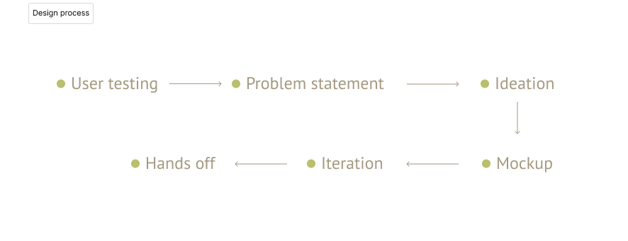
Working as the only designer in the team, I designed the website version of the volunteer service platform for Social Career. Meanwhile, I need to make essential enhancements by learning from the app performance. Although I’ve been provided the brand guidelines, I need to establish a practical design system and iterate the sitemap. As planned, the website was launched phase by phase starting in the middle of 2023.
To make valuable improvements, I conducted user testing and follow-up interviews on the existing APP to obtain user feedback.
⚡ 3/5 of users feel overwhelmed by the large amount of text information on the details page, which made them consider giving up applying for volunteer jobs.
⚡ 5/5 of users expressed impatient with the application process, they want a simpler and more intuitive application flow that reduces friction and allows them to get started quickly.
⚡ 3/5 of users want a highlighted section to learn more about other people’s volunteering options so they can also get involved in the community.
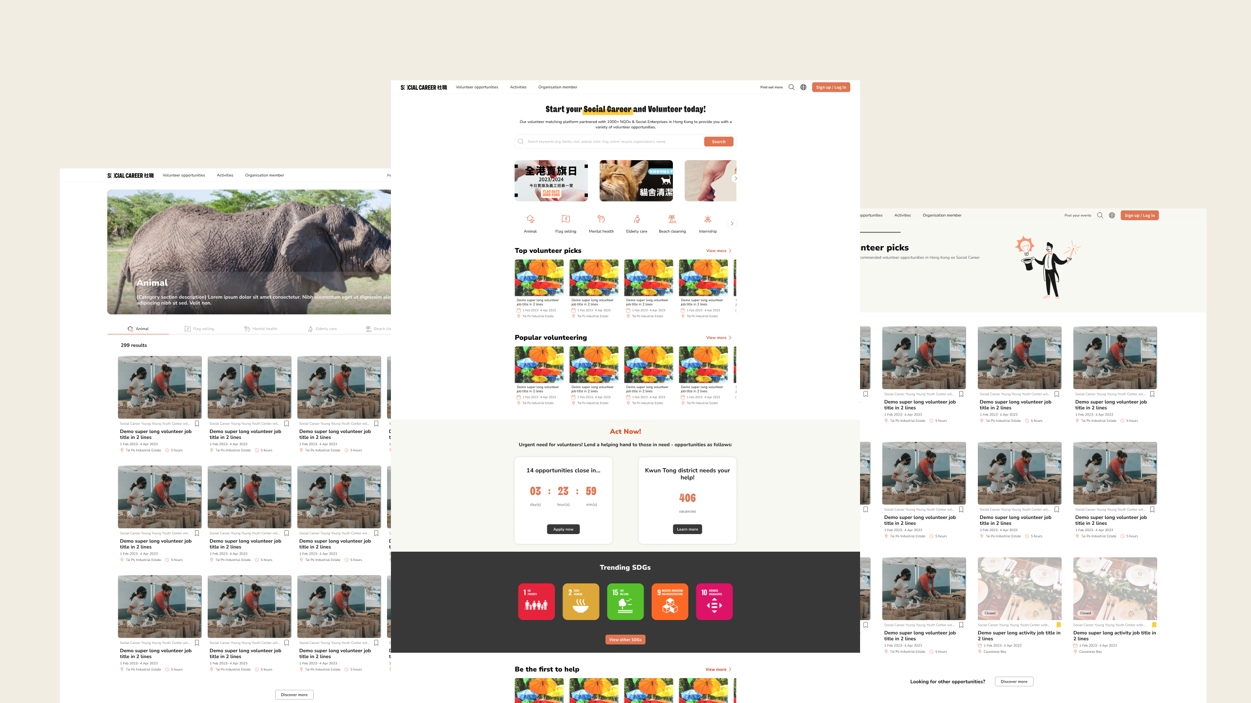
Since I need to put a lot of information on the page, most of it will be in text format and the pages will be quite long. I’ve taken out the date, time, and available quota, so-called key information, to design an action box to contain these along with a join button (CTA). The action box is sticky on the page when the user scrolls up and down. Therefore, users can apply at any time.
From user interviews, users claim they prefer a one-page application form rather than one broken down into short steps. To have a clear application form, I used groupings and visual elements, such as eye-catching keywords, to present the information hierarchy of the page, and minimized churn by limiting actionable buttons.
Based on the business requests I receive, I need to include a bunch of information on different pages. However, too much information can lead to user frustration and reduce the number of successful volunteer applications. I need to find the most balanced layout that would allow users to make decisions as quickly as possible without missing important terms.
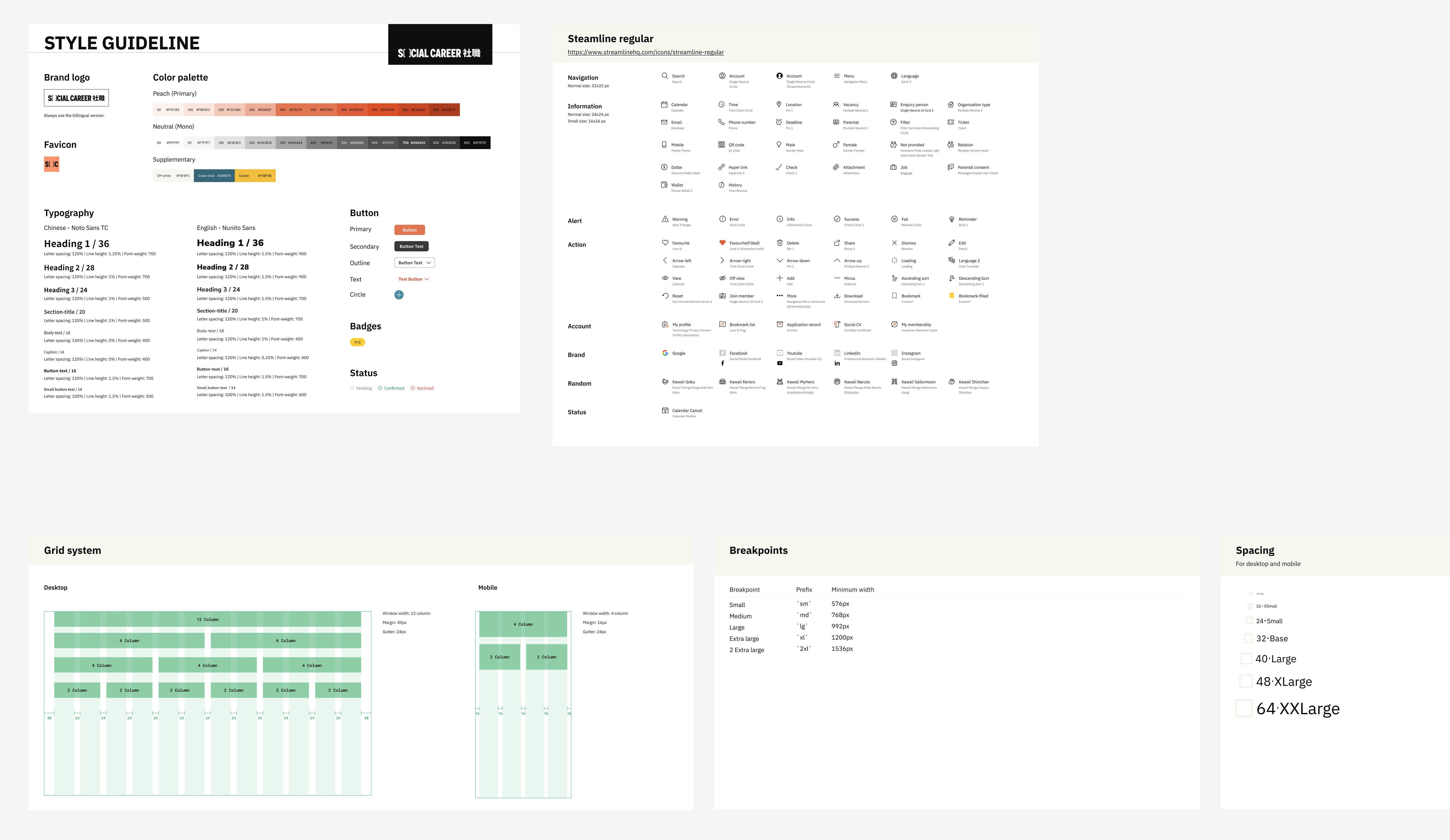
Even though I've been given branding guidelines, it doesn't make it very clear what the actual uses are. Therefore, I had to build my design system, which also needed to fit the style of the current app and branding.